Asurion
Selected projects & case studies.
Enterprise UX · Risk & Decision Support
Project 2
Consumer UX · Growth & Platform Foundations
Role
Sr. Product Designer
Project 1
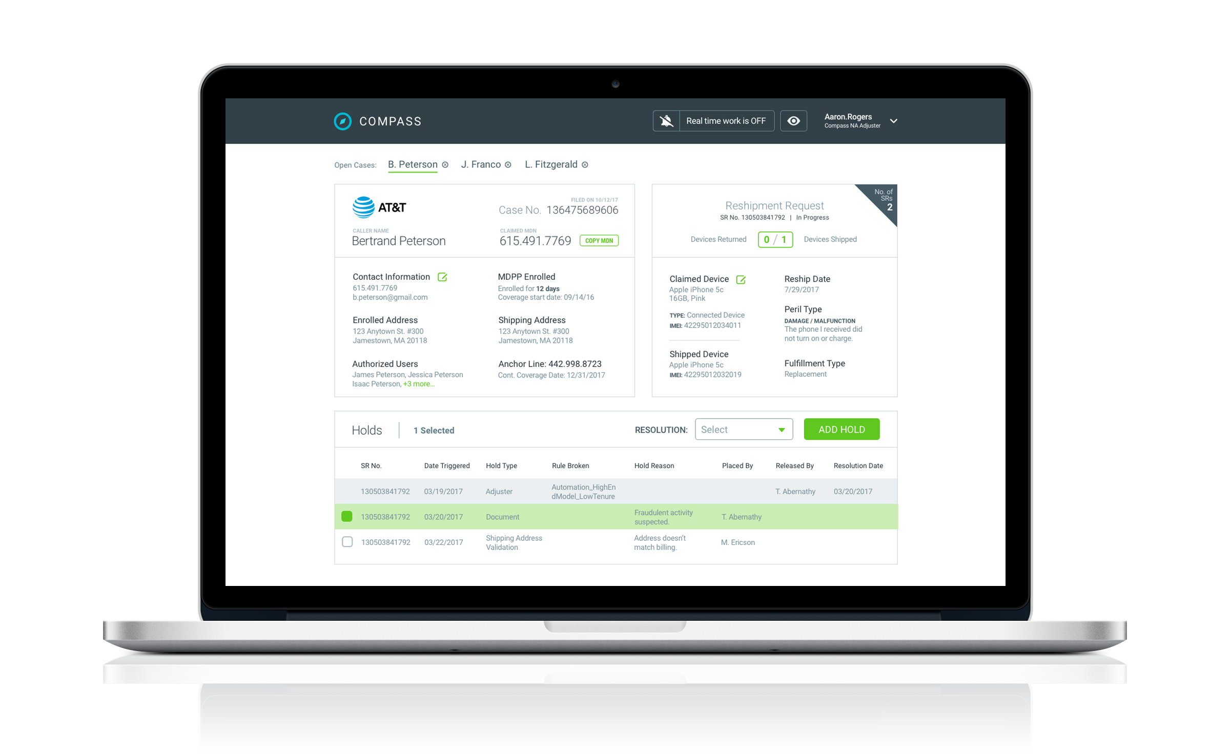
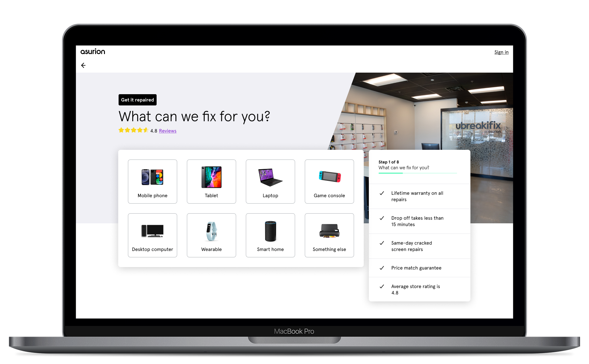
Compass 2.0 – Fraud Mitigation Platform
Enterprise UX · Risk & Decision Support
Compass is an enterprise risk management application used by insurance adjusters at Asurion to adjudicate claims and prevent program abuse. The platform offers advanced fraud-detection capabilities that help analysts identify and stop fraudulent claims. Asurion is an insurance provider that offers smartphone protection plans through major US carriers. Their protection plans provide rapid replacement of lost or damaged devices, and they process millions of claims each year.
Serving as the lead designer on the Compass 2.0 project was one of the most impactful experiences of my 7-year tenure at Asurion. The project immersed me in the complex and largely unseen world of insurance fraud prevention. At the time, Asurion was actively combating organized fraud rings that filed thousands of fraudulent claims per day in an effort to obtain high-value smartphones for resale or use in illicit markets. While the company successfully intercepted a majority of these attempts, the scale and sophistication of the abuse continued to drive rising prevention costs. Improving the efficiency and effectiveness of fraud detection technology became a critical business priority, positioning Compass as a strategic investment in the protection of customers and company resources.
Due to the confidential nature of this project, I can share only limited information about the details and impact of my work.
Problem Space & Context
The first version of Compass struggled with adoption and effectiveness. Like many internally built enterprise tools, it prioritized functionality over usability. While it introduced powerful new capabilities, the experience was dense and cognitively overwhelming for fraud analysts who needed to make high-stakes decisions across large volumes of data. It was paired with nearly half a dozen other tools that analysts had to constantly cycle through.
As a result, analysts spent more time navigating their tools than analyzing cases, thus limiting the platform’s overall impact.

DESIGN GOALS & BUSINESS METRICS
The redesign of Compass focused on improving both user effectiveness and operational efficiency. We aligned on two primary KPIs to evaluate success: Improve decision accuracy for fraud analysts, and reduce the average review time per case.
Supporting goals included:
- Making complex data easier to scan, compare, and interpret
- Increasing analyst confidence in fraud determinations
- Reducing the time required to onboard and train new analysts
- Encouraging adoption of advanced detection features without increasing cognitive load
Discovery & Research
To better understand how Compass was used in practice, I job shadowed insurance adjusters and fraud analysts as they reviewed live cases. This allowed me to observe workflows end-to-end and identify usability issues firsthand. Analysts were quick to tell me about the challenges of their role and the process inefficiencies they faced each day.
Through direct observation and follow-up discussions, I uncovered key challenges, including:
- Analysts spending significant time navigating the interface rather than analyzing risk
- Important fraud signals being buried within dense data layouts
- Workarounds and manual note-taking (often handwritten on sticky notes) to compensate for missing system feedback
- Inconsistent workflows driven by unclear prioritization within the tool
These insights informed both the structural redesign of Compass 2.0 and the prioritization of features that would meaningfully improve analyst effectiveness.


The redesign of Compass required ongoing collaboration between multiple teams and stakeholders within Program Management. Design sprints surfaced technical and operational constraints early and accelerated decision-making across design, product, and engineering.
SOLUTION DESIGN
Compass 2.0 was redesigned from the ground up with a strong focus on progressive disclosure, visual hierarchy, and decision support. I led the design of a refreshed UI and feature set that:
- Clarified information architecture to surface the most relevant signals first
- Reduced cognitive load through layout, grouping, and visual prioritization
- Supported faster pattern recognition across cases
Design concepts were prototyped and tested iteratively with fraud analysts, creating a continuous feedback loop between users, design, and product. This iterative approach ensured that usability improvements directly mapped to analyst needs rather than assumed workflows.
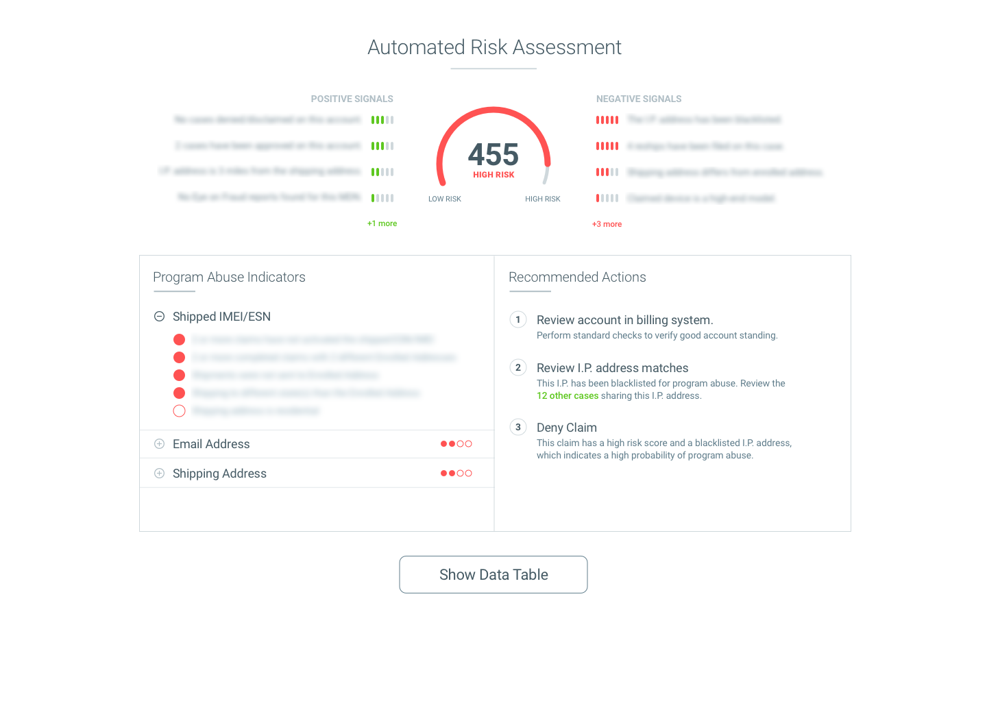
AI risk scoring helped analysts quickly identify the most important fraud signals.
After launching Compass 2.0, we shifted focus from usability to decision intelligence. I collaborated with product and engineering to introduce new feature sets, including:
- Link Analysis, which surfaced relationships and shared attributes across historical cases
- Automated Risk Assessment, which leveraged AI to evaluate signals and assign a risk score to each case
These tools guided analysts toward the most important areas of investigation, allowing them to focus attention where it mattered most.
OUTCOMES & IMPACT
The redesign of Compass and the introduction of decision-support features delivered measurable improvements across key business metrics.
By enabling analysts to make better, faster decisions, Compass became the core platform for fraud prevention at Asurion. It reduced reliance on many external tools and enabled analysts to move quickly while staying focused on their adjudication process. The program’s increased effectiveness enabled a higher volume of claims to be processed without increasing headcount. The project became a huge success for Asurion, and I am proud of the work our team accomplished.
For confidentiality reasons, I have omitted the actual values for these metrics.
39
%
reduction in average case review time
71
%
increase in adoption of advanced fraud detection features
48
%
improvement in fraud decision accuracy
Project 2
Home Service Scheduling
Consumer UX · Growth & Platform Foundations
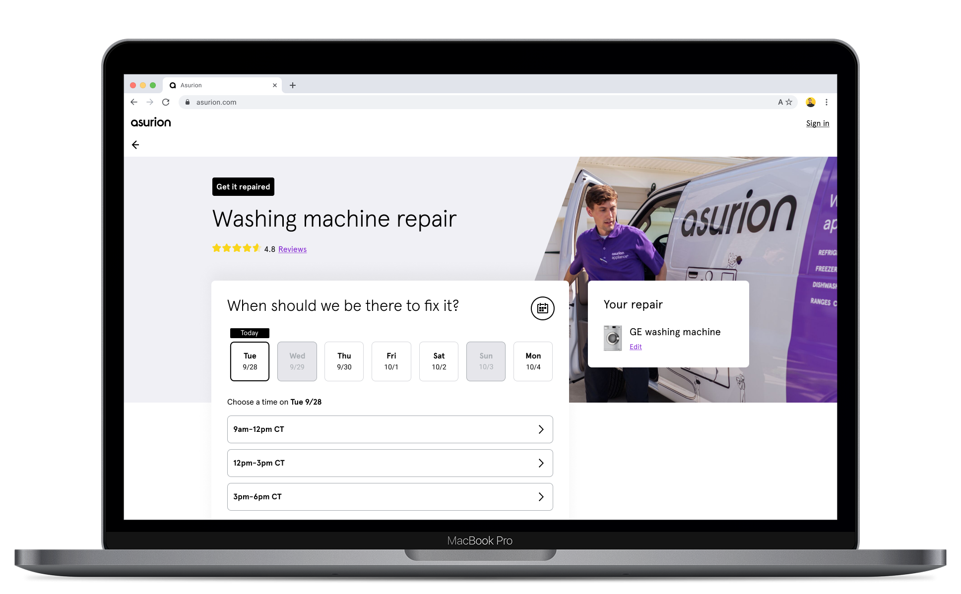
Asurion expanded into in-home repair and tech support in late 2020 with the launch of Home+, marking a strategic move beyond device insurance and retail walk-in repairs. This expansion enabled customers to receive on-site support for diagnosing, repairing, and setting up home technology.
In 2022, Asurion introduced Appliance Repair as a dedicated in-home service, providing next-day repairs for major household appliances such as refrigerators, dishwashers, washers, and dryers. The initial pilot proved successful and positioned the service for expansion into additional major U.S. markets.
At the time, however, appliance repair appointments could only be scheduled by phone. As demand increased, this model became costly and unsustainable, creating the need for a scalable, digital scheduling experience to support continued growth.
Problem Space & Context
The phone-only scheduling model introduced several critical challenges:
- High operational costs driven by call center dependency
- Limited scalability, constraining market expansion
- Friction for customers who expected fast, self-service booking
- Inconsistent scheduling experiences across Asurion’s growing portfolio of home services
To unlock growth and improve the customer experience, Asurion needed an online scheduling solution that could reduce friction, improve completion rates, and scale efficiently across markets and service types.
I served as the lead designer on the 6-person product team responsible for addressing this problem.

DESIGN GOALS & BUSINESS METRICS
The primary goals of the project were to:
- Make it easy for customers to schedule an appliance repair online
- Improve start-to-finish scheduling completion rates
- Enable the service to scale to up to 15 markets by June of ’22
From a business perspective, the value was twofold:
- For customers: Quickly understand availability and pricing without calling a support center
- For Asurion: Reduce call center costs and unlock faster service expansion
A secondary goal emerged as the project progressed: Asurion’s growing portfolio of home services, each with its own bespoke scheduling flow, highlighted the need for a universal scheduling component. Our team was asked to establish the foundation for a reusable scheduling module that could support multiple service types with a consistent customer experience.
Discovery & Research
To inform the design, I began by analyzing best-in-class scheduling experiences from platforms such as Airbnb, Thumbtack, and TaskRabbit, focusing on how they structured inputs, communicated availability, and reduced friction in multi-step flows.
In parallel, I audited Asurion’s existing scheduling patterns across other services and reviewed performance data to understand where users dropped off or encountered confusion. I then partnered closely with my Product Manager to:
- Define functional and technical requirements
- Align on success metrics
- Establish a flexible framework that could scale beyond appliance repair
This combination of external inspiration and internal performance data helped ground the solution in both proven UX patterns and Asurion’s unique operational constraints.
SOLUTION DESIGN
Based on research and requirements gathering, we identified the minimum data requirements to schedule an appliance repair. I then optimized the order of user inputs to collect the needed information as efficiently as possible:
- Appliance type selection
- Appliance brand and customer ZIP code
- Optional freeform description of the issue
- Date and time selection via calendar
- Customer address
- Contact information
I designed the flow to progressively disclose complexity, allowing users to move forward quickly without feeling overwhelmed.
To humanize the service and build trust, I made photography of Asurion Experts in the field a prominent visual element throughout the experience. This was reinforced by displaying customer star ratings and a direct link to real customer reviews.
These elements helped communicate the value of the service and reassured users that they were booking a high-quality, in-home experience.
The resulting design also served as the starting point for Asurion’s universal scheduler, establishing reusable patterns that could be extended to other home services.


OUTCOMES & IMPACT
The online scheduling experience unlocked meaningful improvements for both customers and the business:
- 28% increase in scheduling completion rates
- 40% reduction in phone-based scheduling volume
- Enabled expansion of appliance repair into additional U.S. markets
- Established a starting framework for a home services scheduling module
The project played a key role in transforming appliance repair from a pilot program into a scalable growth channel for Asurion.
28
%
increase in scheduling completion rates
40
%
reduction in phone-based scheduling volume
SCALING THE PATTERN
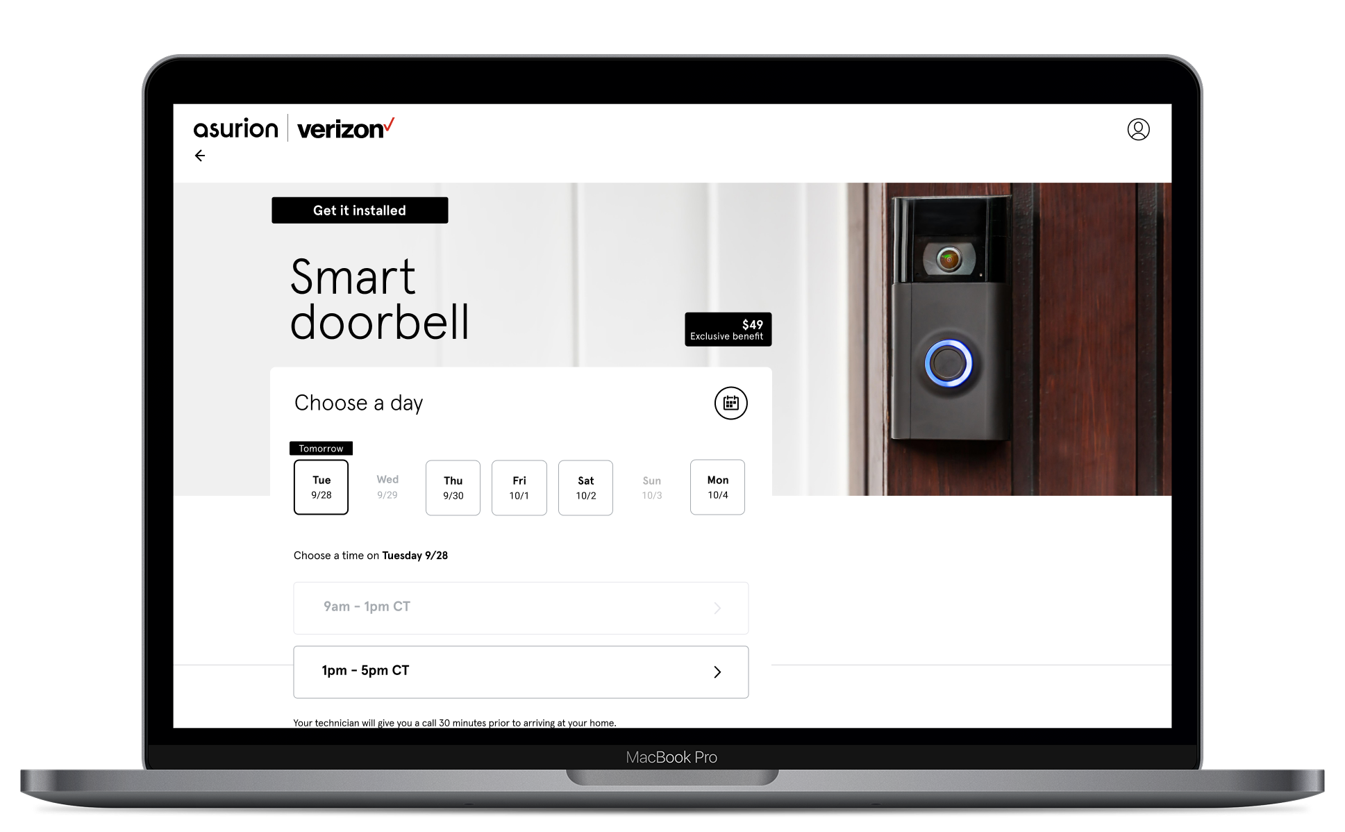
After launching the new scheduling pattern for appliance repair, I had the opportunity to extend the experience across other Asurion products. This allowed me to stress-test the pattern’s flexibility and determine whether it could truly function as a universal scheduling solution.
When Asurion partnered with Verizon to offer installation and support services for smart home devices, I was tasked with designing a co-branded scheduling experience that leveraged the appliance repair framework. I needed to adapt the pattern to a new service category with different brand requirements and operational rules, all without rebuilding the flow from scratch.
Using the modular structure established in the appliance repair experience, I was able to:
- Reconfigure service-specific inputs while maintaining consistent step logic
- Adapt the UI to support Verizon co-branding guidelines
- Preserve trust-building elements such as ratings and technician visibility
- Maintain a consistent mental model across service types
Around the same time, I provided design guidance to a colleague developing a scheduling flow for Asurion’s tech repair services. By sharing the structural framework, component patterns, and sequencing logic from the original project, we avoided duplicative design work and improved cross-product consistency.
What began as a growth initiative for appliance repair evolved into a reusable scheduling foundation that accelerated development across multiple service lines.
BONUS UX HIGHLIGHTS
before
Ambiguity delays
decision making
When a claim was filed for a broken TV, customers were directed to Asurion’s online replacement portal to select from a list of comparable models.
In the original UI, customers had to open each TV listing individually to view specifications and features. This limitation delayed decision-making and led to high drop-off rates.
UI Refresh – TV Replacement Portal
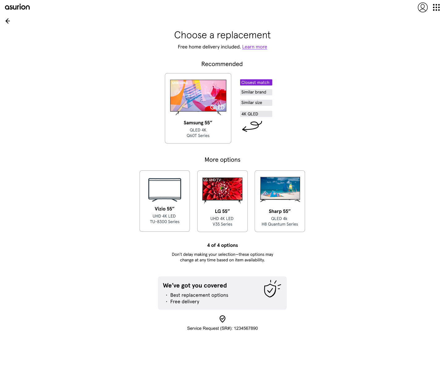
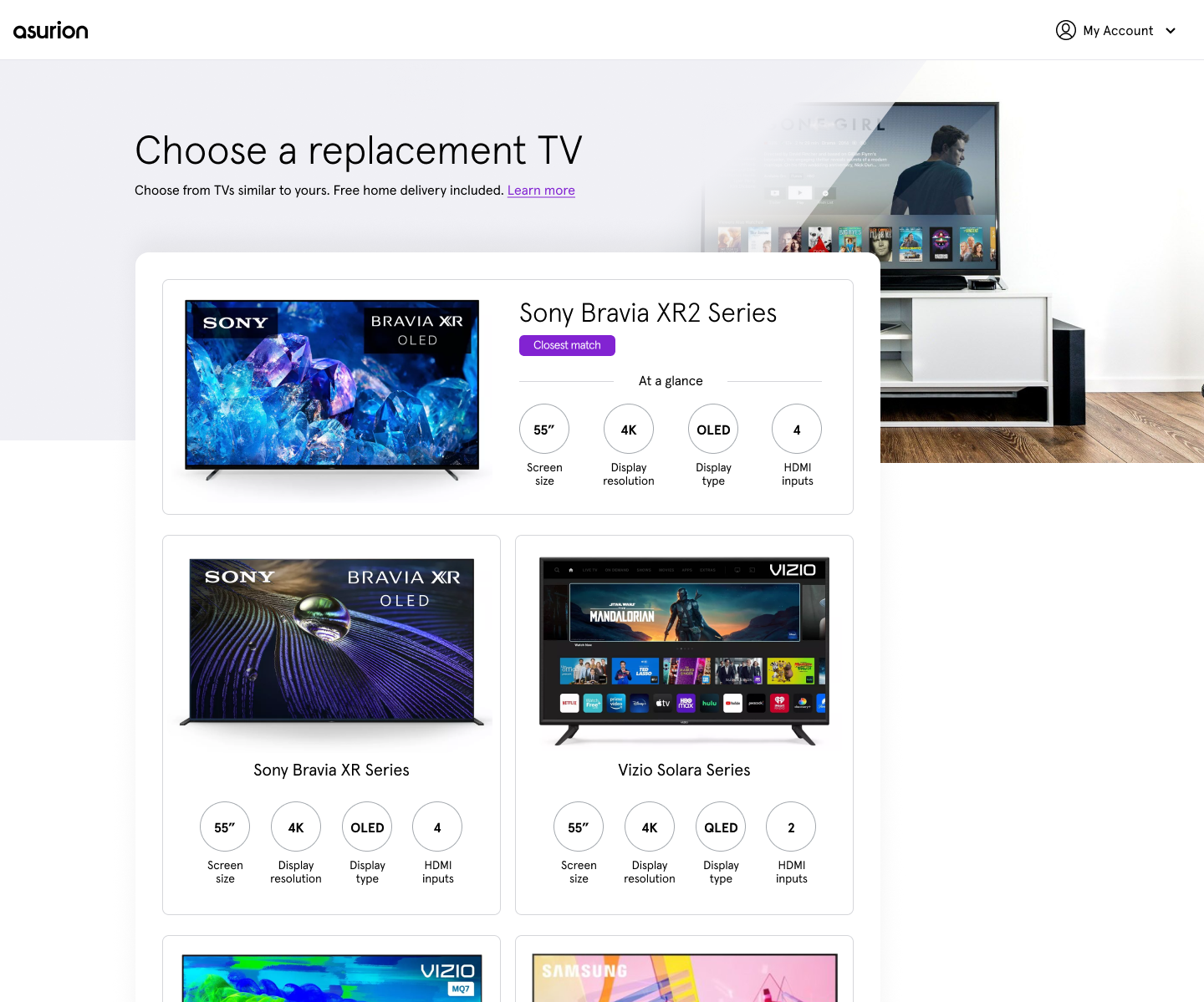
after
Specifications add comparison clarity
I redesigned the replacement portal with the goal of surfacing the most important device specs on the selection page.
This helped customers to quickly identify the most suitable replacement option and reduced drop-off rates.
Point-of-Sale Checkout – uBreakiFix
Following Asurion’s acquisition of uBreakiFix, the company invested heavily in modernizing its retail technology to accelerate growth. I partnered with a cross-functional team to enhance the in-store point-of-sale platform, with the goal of improving associate efficiency and increasing upsell volume for services and accessories.
As the lead designer for the checkout workstream, I focused on simplifying complex workflows, surfacing relevant customer context, and creating upsell opportunities within the transaction flow. Balancing speed, operational accuracy, and revenue optimization in a fast-paced retail environment made this one of the most challenging (and rewarding) UX initiatives I led at Asurion.

Explore More Work
CareCrown